The D&B Hoovers dashboard turns a static homepage into a personalized workspace for sales reps. I led the redesign end to end, winning back 40% of disengaged users.
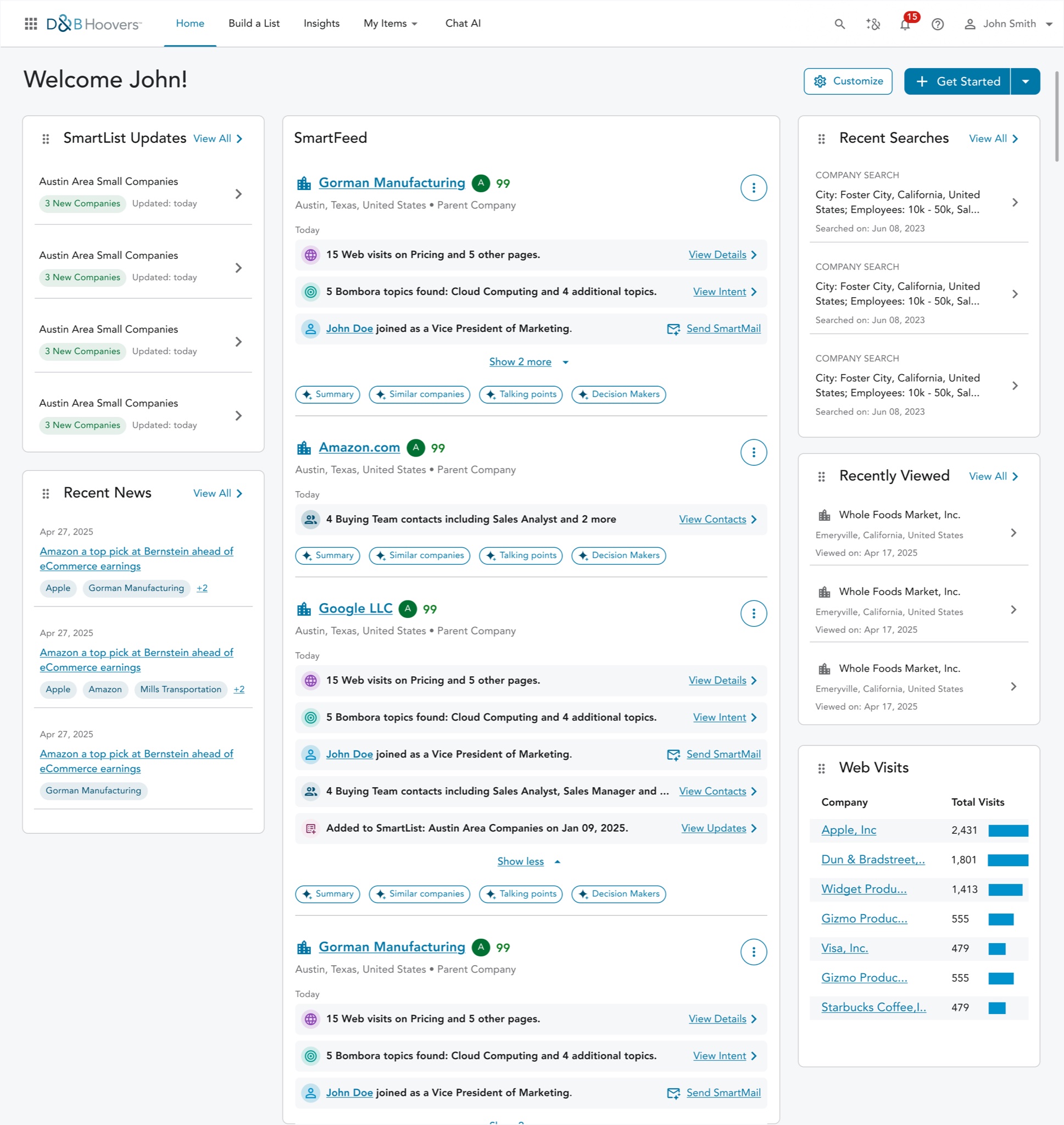
Overview
Imagine starting your day on a page with nothing to do.
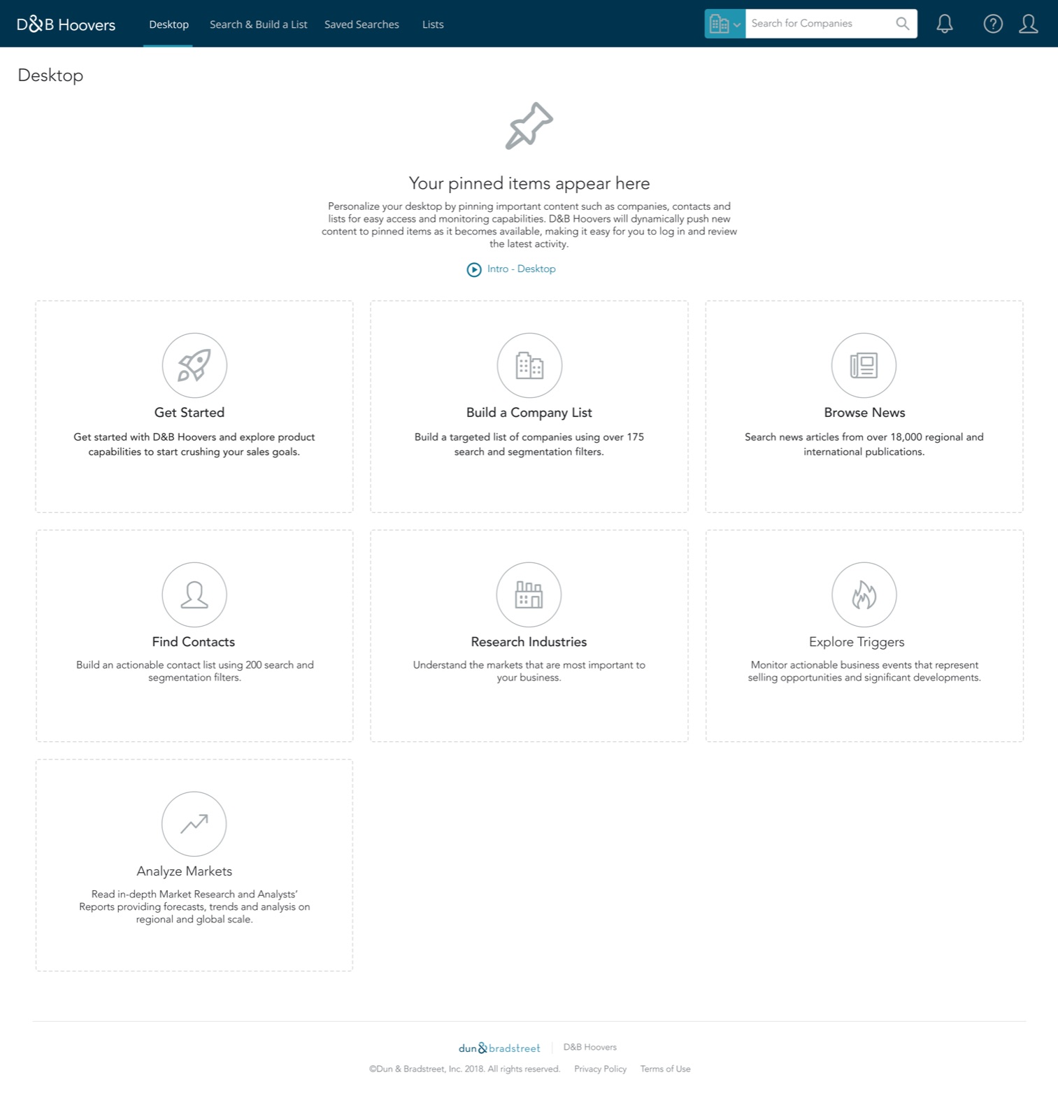
You’re a sales rep signing in to D&B Hoovers, a sales intelligence platform. The first page you see lets you pin companies and contacts, and that’s it. Nothing tells you what changed or what to act on.
That was Desktop, the old homepage, and the problem I set out to solve: make the dashboard valuable enough that reps would choose to start there.
My Role
Driving the work from brief to rollout.
I partnered with product and engineering to turn research into priorities, shape the dashboard, and plan a smooth transition for existing users.
The Problem
Most reps skipped the homepage entirely.
Gainsight usage data showed more than 60% of users weren’t using the homepage at all. They went straight to other parts of Hoovers to get their work done.
Even D&B’s own onboarding team left it out when introducing Hoovers to new customers. If the people teaching the product didn’t see its value, the homepage wasn’t just underused. It had failed.
The Challenge
Help reps move from information to action.
The brief was to make the homepage more actionable. Before designing anything, I wanted to understand what “actionable” meant to reps, because adding more information wasn’t the answer.
The Design Approach
Understanding what reps actually needed.
Usage data, workshops, and usability testing told a clear story: reps didn’t need more data. They needed to know what changed on their accounts and what to do about it. Three priorities shaped the experience.
-
Relevance
Reps cared about what had changed on their accounts, like new web visits, buying intent, or a new decision maker, not profiles they’d already read.
-
Personalization
A rep with a handful of named accounts and a rep covering a whole territory needed different starting points.
-
Actionability
A signal like a pricing page visit only mattered if the next move was one click away: email the buyer, find the right contact, or save the account.
The Transformation
A homepage that tells reps what to do next.
Each priority became a design shift:
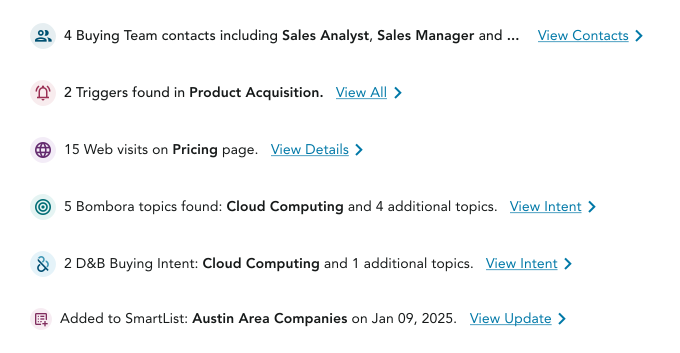
Signals over information overload. I cut secondary company details and gave every signal, any change that hints an account may be ready to buy, the same simple shape: what changed, and where to go next.
Customization over generic experiences. Reps choose which widgets appear and in what order. Onboarding asks about their companies, territories, and activities, so the page is useful from day one.
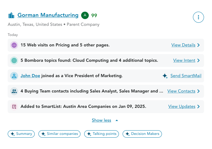
Action over passive consumption. I made SmartFeed the heart of the dashboard. Every update comes with a next step, like Send SmartMail or View Contacts, plus AI shortcuts for a summary, talking points, or the right decision makers. Reps can act without leaving the page.
All of it had to work in 20 languages. A temporary Pinned Items widget let existing users switch over without losing what they relied on.
The Impact
A homepage reps now rely on.
There's more to this story
The research, explorations, and tradeoffs behind this redesign are best told in person. I’d be happy to walk you through them.
More projects

SmartMail AI
An AI powered experience that turns customer intelligence into personalized sales outreach, cutting email prep time by 60%.

D&B AI Assistant
Coming soonA conversational AI experience that helps sales teams research accounts, uncover insights, and decide their next best action.